options(warn = -1)

# Load the necessary packages
library(ggplot2)
library(dplyr)

# Set seed for reproducibility
set.seed(42)

# No. of data points
N <- 20

# Generate data points with moderately correlated random variables
# in a data.frame
dat   <- data.frame( x = rnorm(N))
dat$y <- dat$x + rnorm(N, sd = 2)Plotting covariance
Motivation
While I use methods and models which use covariance quite a lot, it took surprisingly long before the concept of covariance intuitively clicked for me.
In order to help others and to remind myself of the basics, I dusted off an idea I saw on statsexchange a long time ago to visualize the covariance between two variables.
Setting up & plotting
We need two variables which are preferably correlated with each other. So lets generate them below. To adhere to my internal standard, I’ll put them in a data frame.
Then we move on to the idea itself, which is to think of the individual point’s deviation from the center point (with the xy coordinates mean(x),mean(y)) as a rectangle. If the deviation from x and from y is such that their product’s sign is negative, plot them in a different color.
The ‘negative’ areas may be unfamiliar to grok, but it comes down to th fact that they are a product of two numbers, which may be negative. I think its easier to understand if you think that the rectangles are ‘flipped’ if the ‘length’ of one of their sides is negative, and they are colored different on their ‘other side’. It holds up also when they are flipped twice when both of their sides are negative. A rectangle with an area of -2 therefore is a rectangle with an area of 2 which has been flipped.
The code itself has three parts.
First, plot the points on a scatterplot which has the center and the theoretical center plotted on it.
Second, make a new data frame with some additional calculations, such as the difference from each axis’ mean along with the area of the rectangle (with the appropriate sign). Some stuff is also done here for the next graph, eg. calculating x positions if we were to ‘put’ (plot) the rectangles side by side.
Third, update the plot we’ve done at the first step with the rectangles, and plot the results.
# calculate the center of the data
dat_cent <- colMeans(dat)


# Plot the data
fig_cov <-
  ggplot(dat, aes(x = x, y = y)) +
    geom_point() +
    # A single point for the center
    geom_point(aes(x = dat_cent[1], y = dat_cent[2]), color = "red", size = 3) +
    geom_point(aes(x = 0, y = 0), color = "purple", size = 2, alpha = 0.75) +

    tidyquant::theme_tq() +
    labs(title = "Visualizing covariance",
         x = "X-axis",
         y = "Y-axis",
         fill = "'Sign' of area",
         caption = "Red point: Mean of the data\n
         Purple point: Theoretical mean of the data (unknown in most cases)")
Registered S3 method overwritten by 'quantmod':
method from
as.zoo.data.frame zoo # calculate the rectangles area from the center up until each indiv. points
dat_rect <- dat %>%
mutate(x_rect_len = x - dat_cent[1],
y_rect_len = y - dat_cent[2],
area = x_rect_len * y_rect_len,
sign = sign(area)) %>%
arrange(area) %>%
# calc. x values if we plot the rects. one next to another for fig_rects
mutate(x_start = lag(cumsum(abs(x_rect_len)), default = 0) + row_number() * 0.1,
x_end = x_start + abs(x_rect_len))
# set the reddish and bluish colors for the sign of the area
colors_sign <- c("cyan", "firebrick")
# Add rectangles to the plot from the center up until each indiv. points
fig_cov <-
fig_cov +
geom_rect( data = dat_rect,
mapping =
aes(xmin = dat_cent[1],
xmax = x,
ymin = dat_cent[2],
ymax = y,
fill = factor(sign)),
alpha = 0.3) +
scale_fill_manual(values = colors_sign)
fig_cov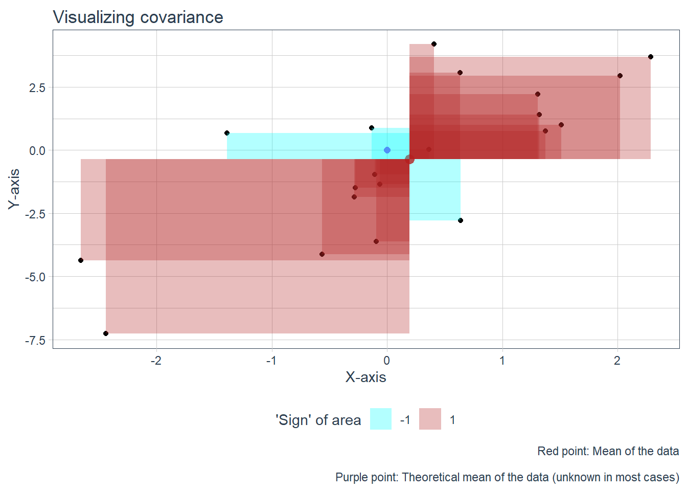
Now for the fun part! We plot the rectangles side-by side arranged by their size. Don’t forget, we are trying to arrive at an ‘average’ area for the rectangles. The rectangles are colored by the sign of their area. It is easy to glimpse if the covariance will positive or negative, just by seeing how much of each color is in the plot.
# Plot the rectangles from smallest to largest
fig_rects <-
  dat_rect %>%
  ggplot(aes(xmin = x_start, xmax = x_end,
             ymin = 0, ymax = abs(y_rect_len) * sign,
             fill = factor(sign))) +
    geom_rect(alpha = 1) +
    tidyquant::theme_tq() +
    scale_x_continuous(breaks = c(0,1)) +
    scale_y_continuous(breaks = c(0,1)) +
    scale_fill_manual(values = colors_sign) +
    labs(title = "Rectangles from previous plot arranged by size",
         x = "",
         y = "",
         fill = "Sign of area")

fig_rects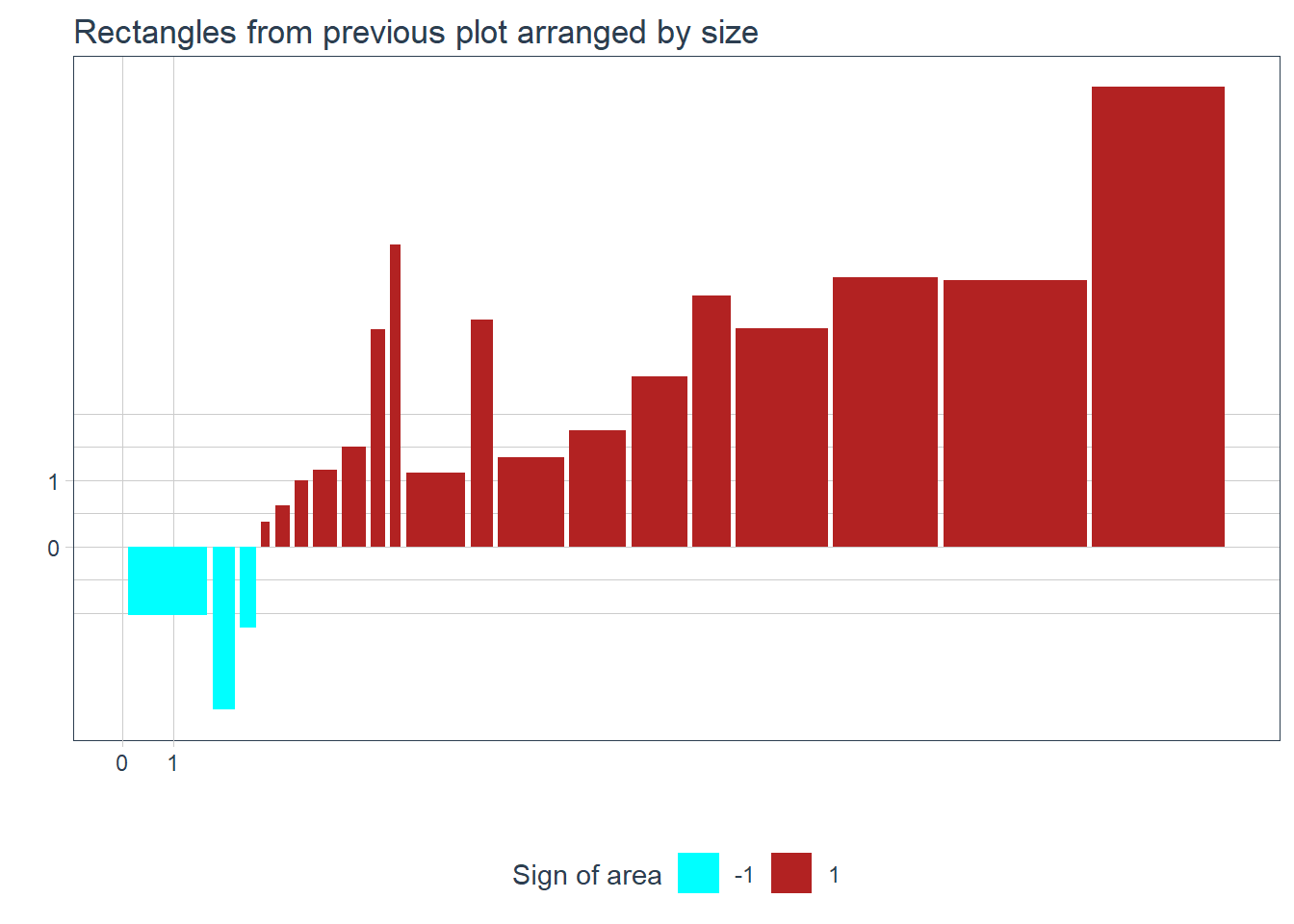
Its all numbers now
I don’t think we humans are set up to compare areas of rectangles easily, so its the end of the analogy, and lets go back to representing the (areas of the) rectangles as numbers. However we are (basically) trying to find the arithmetic mean of the areas of the rectangles, so this will be easy without geometry.
print( dat_rect$area) [1] -1.63043291 -1.08698787 -0.39895812 0.06323706 0.18389324 0.25276008
[7] 0.53970431 0.71573905 0.93737764 0.96506333 1.30607373 1.50461762
[13] 1.77756563 1.96578902 2.85564343 2.85793717 6.00678982 8.47606248
[19] 11.41687848 18.21300792As you can see in the next codechunk, we are not there yet, but almost!
# So is this the covariance?
cov_arith <- mean(dat_rect$area)
cov_arith
[1] 2.846088cov_func <- cov(dat_rect$x, dat_rect$y)
cov_func[1] 2.995882Bessel’s correction is missing. Basically, we constructed the rectangles by using the arithmetic mean for the coordinates of the starting point, which is just an approximation of the true mean. Since we have approximated the mean from the data, we are biased based on the data, and therefore our approximation is somewhat closer to (the totality of all our) points than the true mean would be. Therefore, the rectangles are a bit smaller than they should be, and the covariance is a bit smaller than it should be. Bessel’s correction takes care of that with dividing by n-1 instead of n when computing the ‘mean’.
# We can show that this is in fact Bessel's corr.
cov_arith_bessel <- cov_arith * (N/(N - 1))
cov_arith_bessel
[1] 2.995882# Just for dragging it out and making it painfully obvious
cov_func == cov_arith_bessel[1] TRUEAnd there you have it! We have visualized the covariance between two variables by constructing rectangles from the center of the data to each individual point and flipping the rectangles when these differences were negative. Then we calculated size (area) of the rectangles allowing for negative values when flipped, and after Bessel’s correction we have arrived at the covariance.
All of the properties of covariance hold intuitively.
- A lot of big flipped rectangles imply negative covariance.
- Bigger rectangles mean bigger covariance.
- Rescaling one of the variables impacts covariance.
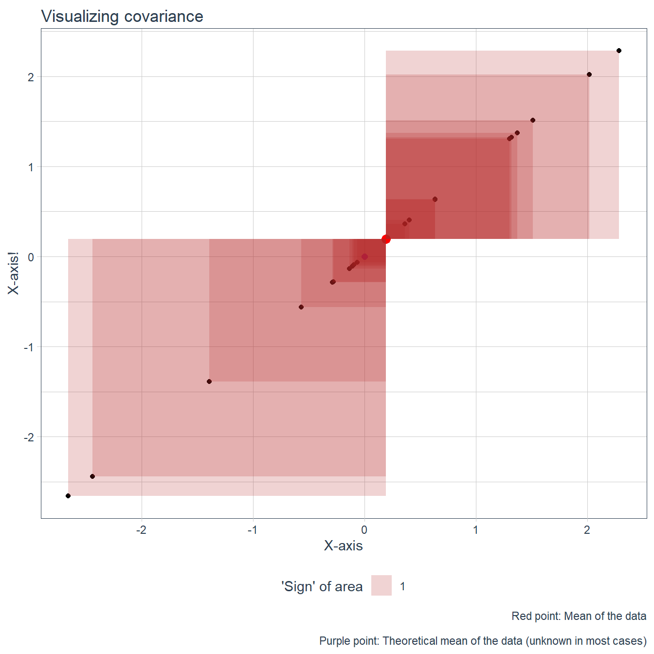
- If X == Y, the rectangles are in fact squares and we have variance of X (or Y; we even have to invoke the Bessel correction) which is a type of covariance.
This last point is so cool I have to visualize it also. It also can reinforce the positive/negative aspect, eg. why variance is always positive based on this analogy.
# Plot the data
fig_var <-
  ggplot(dat, aes(x = x, y = x)) +
  geom_point() +
  # A single point for the center
  geom_point(aes(x = dat_cent[1], y = dat_cent[1]), color = "red", size = 3) +
  geom_point(aes(x = 0, y = 0), color = "purple", size = 2, alpha = 0.75) +
  tidyquant::theme_tq() +
  labs(title = "Visualizing covariance",
       x = "X-axis",
       y = "X-axis!",
       fill = "'Sign' of area",
       caption = "Red point: Mean of the data\n
       Purple point: Theoretical mean of the data (unknown in most cases)")


# Add rectangles to the plot from the center up until each indiv. points
fig_var <-
  fig_var +
  geom_rect( data = dat_rect,
             mapping =
               aes(xmin = dat_cent[1],
                   xmax = x,
                   ymin = dat_cent[1],
                   ymax = x,
                   fill = factor(sign(x_rect_len*x_rect_len))),
             alpha = 0.2) +
    scale_fill_manual(values = colors_sign[2])


fig_var